Monday 15 December 2014

Week 11: Stylised tree

This week was the final week of the tree project as well as the last week of university before Christmas!


I'm quite pleased with the outcomes of both my trees. Considering they were so easy to make and I had one finished in the first week I had plenty of time to re-texture/improve both.

I think I probably could have experimented more with various approaches to my trees though considering the amount of time I had- the green-leaved tree looks okay from the front but from the side/below the planes aren't very well placed in order to give it a dense look from all angles. 

 
I managed to get one of my trees into engine (the other had some lighting issues that I don't know how to solve). I really like the colours of the leaves in comparison to the greens in the scene and I'm really pleased with how it all turned out!

Wednesday 10 December 2014

Week 10: Stylised tree

This week we were set the next part of our village project, the stylised tree. Because it was such an easy project it was recommended that we didn't spend long on concepting and instead modelled an already existing tree/based our model off one at least. As well as this we had to create two trees.


To begin with I opened up some of the photos I took of Bradgate and did a few simplified silhouettes of the shapes I liked.


This helped me to establish what trees would work better in a more simplified form without getting caught up on any fancy little details. I then attempted to do more silhouettes from these to push the styling further but I quickly realised that it wasn't really helping as there wasn't much else I could do to the original ones I had taken.


I instead did a few drawings and quite liked the turnout of all of them even with the basic shapes. The middle one on the top row I had considered making more of a 'fantasy' tree but thought that it might be taking it too far, especially as the tree isn't going to be a center piece or anything like that.


Since I liked all of the designs I decided to do tonal paintings of each and test various tree colours on them all because like the design, I didn't feel like they really called for anything particularly fancy.

Part of me feels like I haven't really done enough concepting in comparison to others, but then when I consider what we were actually told I'm quite content that I didn't use any more time than I needed on this stage.


I was able to complete my first tree in under a day and I'm relatively happy with the outcome. Although considering the amount of time I still have left I think I will probably re-visit and polish it to a better standard after I've modelled the second tree!

Tuesday 2 December 2014

Week 9: The Farmhouse

Finally after a lot of stress and tedious stuff I've completed my Farmhouse! As I mentioned before, its been a real struggle with my time management and not accommodating for things going wrong but its all done now.

Overall I'm not very happy with my final model.

3D model with wireframe

I found it quite frustrating as I felt I had a strong design that I really liked but modelling was much harder than I expected. As well as this my textures aren't as good as I wished they were- I spent a long time trying to make a tillable texture work and in doing so had to settle for something mediocre. I was really determined to make my building as good as the example ones so I had a really strong piece to go into the levels but I ended up painting too much in my own style and with the wrong kind of brushes (and probably too lazy as well when it came to details).

Model in unreal- the roof really lets it down.

I decided to do a thatched roof early on in my concepts and I still think it was the right kind of roof for a farmhouse but the way I had to unwrap it seriously hinders my model and makes it look very 'rookie' amongst the others which is exactly what I didn't want.


Fortunately we have two more projects to go into the same level so I can use what I have learned to my advantage and hopefully make them much better. If we get the chance to go back to it I know exactly what I need to change!

Friday 28 November 2014

Week 8: Game Production

Overall I've found this week to be incredibly challenging in terms of time management and things not going the way I want them to; I've fallen behind on my Bradgate work, my Village house and my blog as well as failed to complete my Gurus and Grasshoppers project.. and the worst part is? I wasn't even being lazy!

When it came to unwrapping my Farmhouse I ran into every complication possible when I was expecting none. If I hadn't had such an issue with unwrapping I would have kept to the schedule I set for myself and finished in plenty of time which was incredibly frustrating.

Although after the horrible unwrapping phase passed and I'd managed to get it to do what I wanted it to I began texturing which, again, I expected to be plain sailing. With the introduction of tileable textures and multisub materials everything took a lot more time and consideration as well as a lot of trial and error. This in turn resulted in me falling behind my own schedule, although I did feel like I could get it done in time for the deadline I just wouldn't have enough time for messing around with it and making it look good.

Fortunately we were granted another week for 'polishing', this would enable me to take more time with my textures and make sure they looked good.. Although that wasn't the actual intention of the week it was the best I could do with it all things considered!

I'm still quite pleased with my attempt at time keeping, although now I know I need to allow time for mistakes and any other complications. Because of all this I couldn't do all the work I wanted to do (sorry Gurus!) and ended up getting quite stressed but I feel like I've already been able to learn from my mistakes and for future projects I intend to push the concepts out a lot quicker so that I've got more time to trip up in 3D!

Next week will include my final piece and a review of that outcome rather than all my mistakes! Phew!

Week 8: Visual Design

Bradgate Park

This week we went on a 'trip' to Bradgate Park which was beautiful despite the chilly weather. The aim was to gather our own references and first hand experiences rather than everybody using the same reference images straight from the first page of google.

I wasn't able to get any sketches done simply because my fingers were too cold to move! Although I did make sure I took pictures of anything and everything that I thought I may need in the future. I didn't worry about making a great photograph to show off I was more interested in just flat out documenting what was in front of me.

The trees in Bradgate Park were glorious and I was certainly in tree heaven- the different shapes and varieties had me stopping every five seconds to take photos..


Something that was pretty obvious when we got there was the autumn colours, and I tried to take down as much mental colour information as I could while I was there as I knew that the photos I took wouldn't replicate the richness of the colours.

A little later on I decided to do some colour thumbnails instead of just drawing from my photos. I tried to apply the colours I remembered and just used the photos as a reminder of colours and a prompt for visuals. I'm not 100% content with the thumbnails themselves but I felt like I was learning while I was doing them as I needed to apply what I understood about colour already and what I could remember from what I saw. I had to be careful with my oranges, browns and yellows when they merged with one another to make sure they didn't look muddy. With a few of my landscape ones I recognised that I really need to work on depth in the landscape- I feel like I have the knowledge of how to achieve depth but I need to apply it in my paintings and that requires more practice.


I then managed to find the time to work on my Bradgate final. Considering the amount of time this took me and what I thought I'd learned I'm pretty disappointed with the outcome. Although I don't think its bad, I believe I could get a lot more depth in there and nail the colours better to make it look like harsh and cold winter light while still keeping the warm leaves and plants.

Overall its been a very busy week with not a lot to show for it unfortunately!

Sunday 16 November 2014

Week 7: Other bits and pieces

Gurus and Grasshoppers:

After producing a pretty dismal piggy bank for our first project we were given an extension to improve our work so I completely remodelled and retextured my piggy bank making it into a bumblebee:


I'm so much happier with the outcome and pleased with how well my 3D work is improving.

Studies:

I've taken it upon myself to try and do a study a day to keep my painting up to scratch and so I can keep learning.


I began with a tonal face study as I wanted to try and practice a variety of ethnic backgrounds and ages and genders so that when I come to my own character designing I can get a good variety of people and not just pretty girls with the same facial features.

I also began to venture into colour and I hope that I'll be able to get more creative with my studies as the time goes on!

Week 7: Visual design

This week in visual design we were set our new 'Village' project and given a fairly strict style guide to work from. We were put into groups for this project so that we could all be assigned a different building to go into one level.

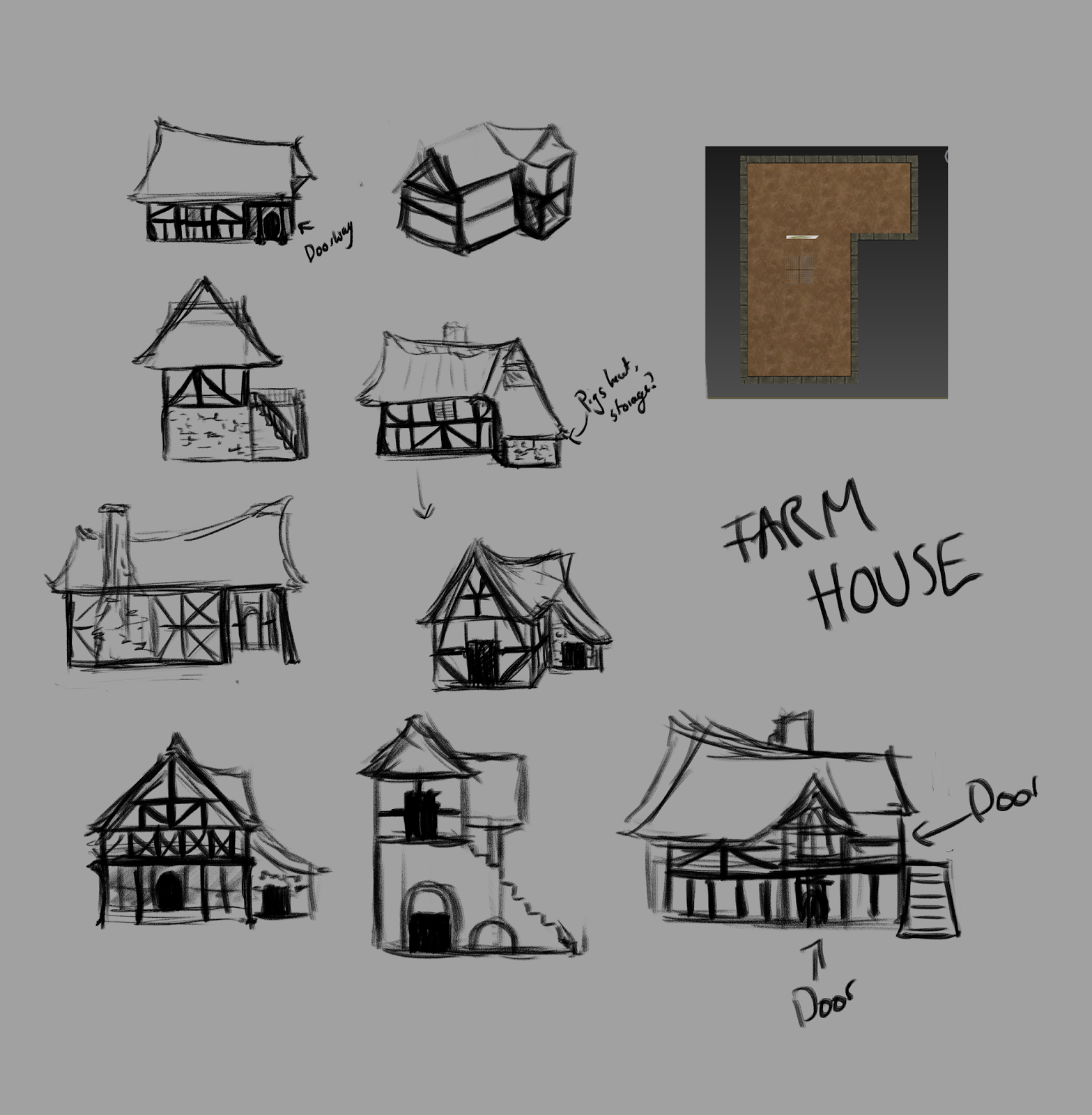
We got together and randomly assigned buildings I then emailed the list to the people that weren't in the class at the time. I got the farmhouse and after some very early research I already had a pretty strong idea of how it would look so I figured that concepting would be quite easy.

For this project I decided to learn from my last in terms of I wish I'd have done more research on the subject matter so that when it came to my own concepts I'd have a better understanding and therefore produce better ideas.


I created a mood board so that I had all the useful images in one place rather than all on my pinterest but I also put some people in traditional costume and other aspects of 'farms' so I could keep in mind the general 'farmhouse' vibe.

I then did some studies from some of the images. I find drawing things forces me to look harder at the images and think and understand how they work rather than just glancing over them.

First round of idea generation
To begin with I started drawing out various ideas with the original base shape in mind. I thought starting here would be better than starting with silhouettes as this project doesn't rely as much on a strong silhouette like the rock did, plus the 3D elements can't be seen from a 2D silhouette.

Developing ideas
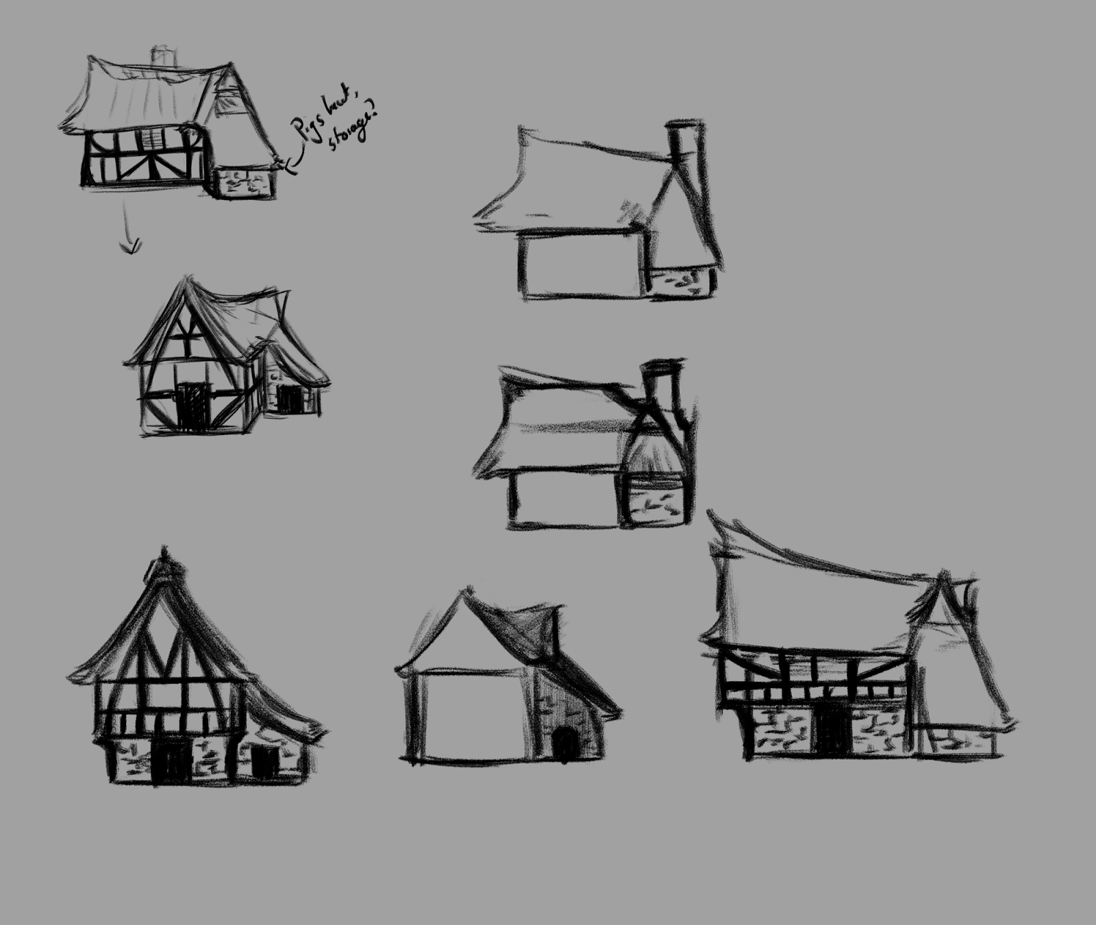
I really liked the idea of a wooden/plaster building with a little brick bit coming off the side which could be used for things like pigs or storage or something. Instead of just settling with that idea I decided I should keep on developing it to get a stronger idea.

I experimented with a stone base and an elevated top but while doing research I had actually read that the richer people had stone bases as well as glass windows so since my house is a farmhouse that isn't generally associated with richness I thought I better leave that idea.


It was when I had got this far that I considered silhouettes- they aren't massively different but I wanted the shape of the roof to really give a good impression of the building and make it look quite reserved and soft rather than a big towering and sharp building. 


After the silhouettes had influenced the shape of the roof as well as the addition of the chimney I was able to refine these ideas further into something I was really pleased with. 
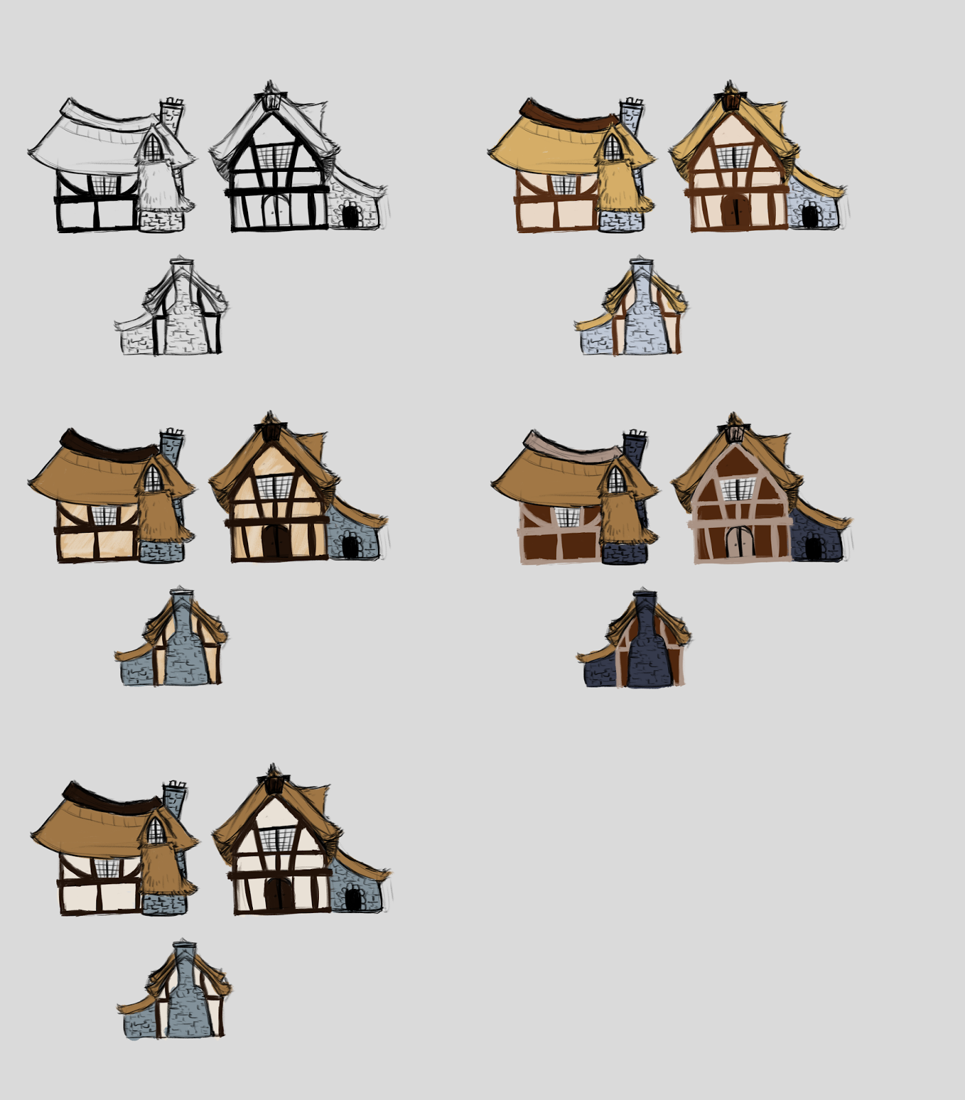
Colour testing
When I had got to this point I decided to start modelling while I was in the labs and carrying on with things like this while I was at home as the colours only effect the texturing and I needed to make valuable use of my time while I had the opportunity to use 3DS max in the labs since as I have a mac I'm unable to use it at home. 


By the end of the week I had managed to get my model this far and I'm quite pleased with my progress! I'm planning on getting more details and information in there when I next work on it but overall it hasn't been a bad week in terms of productivity!

Tuesday 11 November 2014

Week 6: Visual design

A little bit late as per usual but I finished my Guild Hall painting and I'm really pleased with how it turned out!

Painted in Photoshop

With all the projects going on I've found it pretty easy to forget about or neglect my finals but better late than never.

I felt quite motivated to make this good as Chris said he'd be looking at them and possibly sending them forward to the GuildHall themselves if they were good enough and I'm quite eager to impress...


I actually tried a different painting technique with this painting because the photo I got gave me the shape information but not the colours I wanted- I took the picture around 6 or 7 in the evening so it was pretty dark with everything illuminated by street lights.

My reference picture
In order to achieve the colours I wanted and give myself some artistic license I put an underlay of a red and blue to achieve the warm and cold colour bases and then built up on top of it which gave me a lot of pinks and purples which I wouldn't have chosen to use myself but they worked really well on the painting.

In comparison to the photograph I think my GuildHall is a little off perhaps in proportions and maybe perspective but regardless of that I'm really happy with the outcome :)

Week 5 & 6: Game Production

The past two weeks have been so busy I decided I'd plonk it all in one post to summarise the two week project: Stylised Rock!

This project intended to introduce us to working to a certain style and theme as well as a different way of creating textures (painting and not photomanip textures).
I was really eager to start the project because it was a fun theme and gave us so much more leeway to design exactly what we were going to model.

To begin with we had to use Pinterest to begin to gather reference and inspiration, a few of my peers got together to create a joint board so we brought in a wide range of rocks and gems to inspire us before we narrowed down our designs. Doing this we were able to bounce ideas off each other as we pinned which was fun as well as incredibly useful.

Once we had done this I began to create some basic silhouettes; just blocking out some interesting shapes was a really good way of starting from scratch and getting some interesting ideas that I may not have thought of just through sketching.

My first round of silhouettes
 I uploaded these silhouettes on facebook and got a range of feedback and decisions of which rocks worked best. I then took a selection and developed those further:

Round 2: Silhouettes

I found this to be a really good process because I changed bits that I would have just left and actually found some better variations on the original.

Next round of contestants.
Out of the second lot I chose a few of my favourites and started to consider tonal values and what would actually be going on inside the silhouette.


The next stages from concepts to finalised idea got pretty muddled as I took one version quite far but changed it the night before I planned to model it in a moment of weakness.. Although I prefer the final idea I think I should have changed my design earlier on when I had doubts rather than 'oh I'll see if it looks better if I add colour'.

My final design and model.
Overall I'm really pleased with what I have produced. I feel like I've definitely improved since the previous projects and I really enjoyed hand painting my rock. I do feel like I could have got a stronger design if I spent more time pushing it further rather than settling because I felt like I needed to get onto the modelling. There are certainly a few things I could have done better such as making better use of my geometry which would have given a stronger shape to texture.

Thursday 6 November 2014

Week 5: Visual design

This week's visual design was pretty straightforward- we had the day cleared of timetabled lessons to go and visit the Guild Hall to do some sketching.

Some of my thumbnail drawings.
I really enjoyed the couple of hours we spent at the guildhall, the structure of it was interesting and quite challenging yet fun to draw- a lot of the beams were wonky and it was quite difficult to make them wonky in the drawings while still looking right. I also drew a couple of details such as chairs to change it up a bit.

As well as this we were told to draw people in a busy place for life drawing.


I found this pretty difficult simply because people walked really quick so I got minimal time to get the gesture right although I did find it got easier the more I did. It was definitely good practice because you learn what parts are the most important when sketching people quickly.

Tuesday 28 October 2014

Week 4: Game production

Wow, this was certainly the most difficult week so far; we were set our new project 'Sci-fi crate' on Tuesday and had a week to complete it. I was a little bit concerned to begin with but figured 'how hard can it be?!'... Very.

I think the biggest mistake I made was at the beginning when I felt comfortable enough to model the crate without watching any tutorial videos. I used the planes provided as reference and managed to model the crate within the first day. That was completely fine until I came to unwrap it. I haven't had much experience in texturing despite my previous knowledge of Maya- its something I really struggled with and kinda managed to do okay-ish if I posed my beauty renders right...

I spent the entire day struggling to unwrap my model, with things just not working how they should with no explanation. After achieving nothing after an at least 8 hour day I decided to give it a rest and come back to it the next day. I eventually realised that I had in actual fact modelled it slightly differently to the example video and my unwraps wouldn't work in the same way so I infact needed to restart my model. So that was two days straight up wasted.. I was a little bit frustrated to say the least but knew that I really needed to up my game.

But after a very long week I achieved what I set out to do!

Beauty render of my crate
Copy of my conclusion of the project because I've already summarised it once!


" Overall I’m generally pleased with what I have produced although I feel like having learnt so much along the way I could probably start it again and do a much better job. 

I think I could probably make the model itself more interesting rather than following the example; I had originally tried to do it myself first time around but ran into some trouble unwrapping and didn’t know how to work with the model I had made so had to restart which was quite frustrating as I had wasted a good two days of my time. Although now that I understand unwrapping better I know I could do a more interesting model and have a better knowledge of how to unwrap it on my own.


As well as this I spent a considerable time experimenting with different textures and different looks; I didn’t decide on exactly how I wanted it to look in terms of metal and how worn it was going to be so I was learning as I went along too which took up a lot more of my time.


Due to the amount of time I essentially spent messing around putting different types of textures on my map I ended up running out of time to come up with a really interesting design. I had decided to do my own design rather than follow the concept which we were told was acceptable but I didn’t spend any time actually designing it so in my opinion it turned out pretty bland in terms of design, although I am pleased with the textures and effects I was able to get onto it and I feel like I learned a lot over the duration of the project.


Also I was introduced to various maps such as bump and specular. I was only able to create a bump map and apply it but if I had more time I’d do some more looking into the different maps so that I could improve my work.


But generally with the complications that I came across I’m glad I achieved this outcome and I know that I have learnt a lot from it so the skills will hopefully follow through to different projects."

Week 4: Visual design

This week in visual design we had quite a sparse day in terms of workload- the majority of digital art was a really interesting talk about idea generation and the use of silhouettes which will be really useful when we begin to generate our own ideas.

Life drawing was actually a struggle simply because we didn't have a teacher or any proper models- we simply had to draw each other which sounds easy enough but I think I actually struggled more.


I think because we all had to draw each other (I at least) found it hard to keep focused with the poses getting more comical as we went on. I think I will probably benefit drawing clothed people in a more public environment where I can focus better on my drawings rather than giggling at my peers struggling to hold their pose! One benefit we found as a group though is that we got a lot more drawings done; we did five minute poses and switched straight after rather than being taught inbetween.

Value studies using different pencils
Lastly we had a short seminar on value range and using your pencils effectively to get the correct range of values.

Sunday 19 October 2014

Week 3: Game production and critical studies

Game production

Our work on our cubee man continued over to our game production work as it served the purpose of helping us to understand texture unwrapping and such.


I'm really pleased with how my little superhero turned out although I think with more iterations I probably could have come up with a better design overall.

 Critical studies

In this week's critical studies we had to create a 3 minute presentation on our favourite character, following a lecture on what makes a good visual character.

I was quite unsure for a few days on what character I would want to present; should I go with my genuine favourite character or should I just pick a design that I really like? I had thought of going with a character from a TV show called Vikings, as I genuinely loved her design and her character, although I wasn't sure that I could say that much about her design as it was only really costume that constituted her design..

I brainstormed some other characters and came up with the idea of Godzilla. I did some really good research and found lots of things to cover on his design but at the last minute I changed my mind because I wasn't a 'true Godzilla fan' I was only really considering him because it was easier not because I adored his design.. Bit of a mistake! I wasn't really happy with how my presentation went. It was partly down to poor preparation and a bit of a weak design that I chose. I also let nerves get the better of me and ended up pretty much reading off my notes which I already knew wasn't a good idea!

But I know what I did wrong so I hope I can use this as a stepping stone to my next presentation (regardless of how much I'm not looking forward to it)

Week 3: Visual design

This week we had to continue our work with perspective but we had moved on to two point. I had found the thought of it a little intimidating at first but when I got down to it I actually found it quite straight forward.

Selection of some two point perspective thumnails, some were done from photos online due to weather!
I already feel like I'm starting to understand perspective a whole lot better than when we began and it really is down to practice, which makes me wonder what else I should look to focus on and improve on. I still have some issues finding the vanishing point but I often find I have a good enough understanding to draw some parts without the construction lines.

I really enjoyed life drawing this week especially as we were able to do longer poses!

Some warm up sketches- two minutes continuous line and two minutes of drawing with the opposite hand.

A seated pose sketch.

My fifteen minute sketch above went a lot quicker than I expected and I realised afterwards that I had exaggerated the perspective of the legs and made them a little too big in comparison to the torso. It was suggested that I stand away from my drawing especially on this scale (A3) so I could check on my scales. Its at this point I miss the digital art comforts of being able to easily re-scale!

In our digital class we had to do something a little different; we needed to design a superhero cubee man. We weren't given much time to design but I decided to go with an iridescent beetle-like design (with some insect controlling superpower perhaps). Rather than looking like a guy in a suit he looked more like a creature but I really liked the colours and shimmer I gave him. We were then told to have it finished and printed on card for the next day.