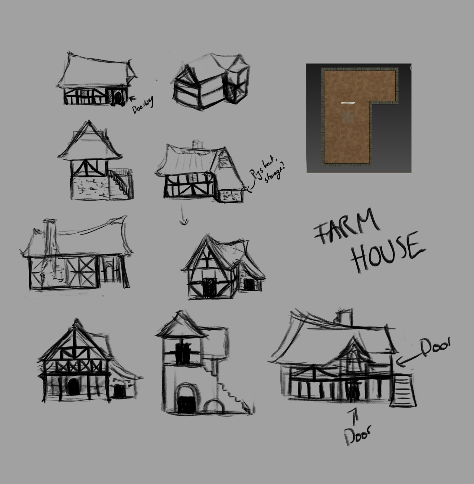
We got together and randomly assigned buildings I then emailed the list to the people that weren't in the class at the time. I got the farmhouse and after some very early research I already had a pretty strong idea of how it would look so I figured that concepting would be quite easy.
For this project I decided to learn from my last in terms of I wish I'd have done more research on the subject matter so that when it came to my own concepts I'd have a better understanding and therefore produce better ideas.
I created a mood board so that I had all the useful images in one place rather than all on my pinterest but I also put some people in traditional costume and other aspects of 'farms' so I could keep in mind the general 'farmhouse' vibe.
I then did some studies from some of the images. I find drawing things forces me to look harder at the images and think and understand how they work rather than just glancing over them.
 |
| First round of idea generation |
 |
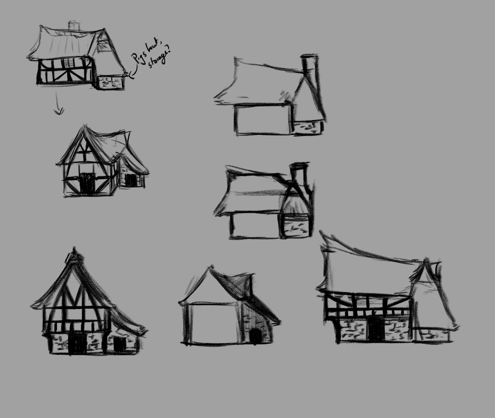
| Developing ideas |
I experimented with a stone base and an elevated top but while doing research I had actually read that the richer people had stone bases as well as glass windows so since my house is a farmhouse that isn't generally associated with richness I thought I better leave that idea.
It was when I had got this far that I considered silhouettes- they aren't massively different but I wanted the shape of the roof to really give a good impression of the building and make it look quite reserved and soft rather than a big towering and sharp building.
After the silhouettes had influenced the shape of the roof as well as the addition of the chimney I was able to refine these ideas further into something I was really pleased with.
 |
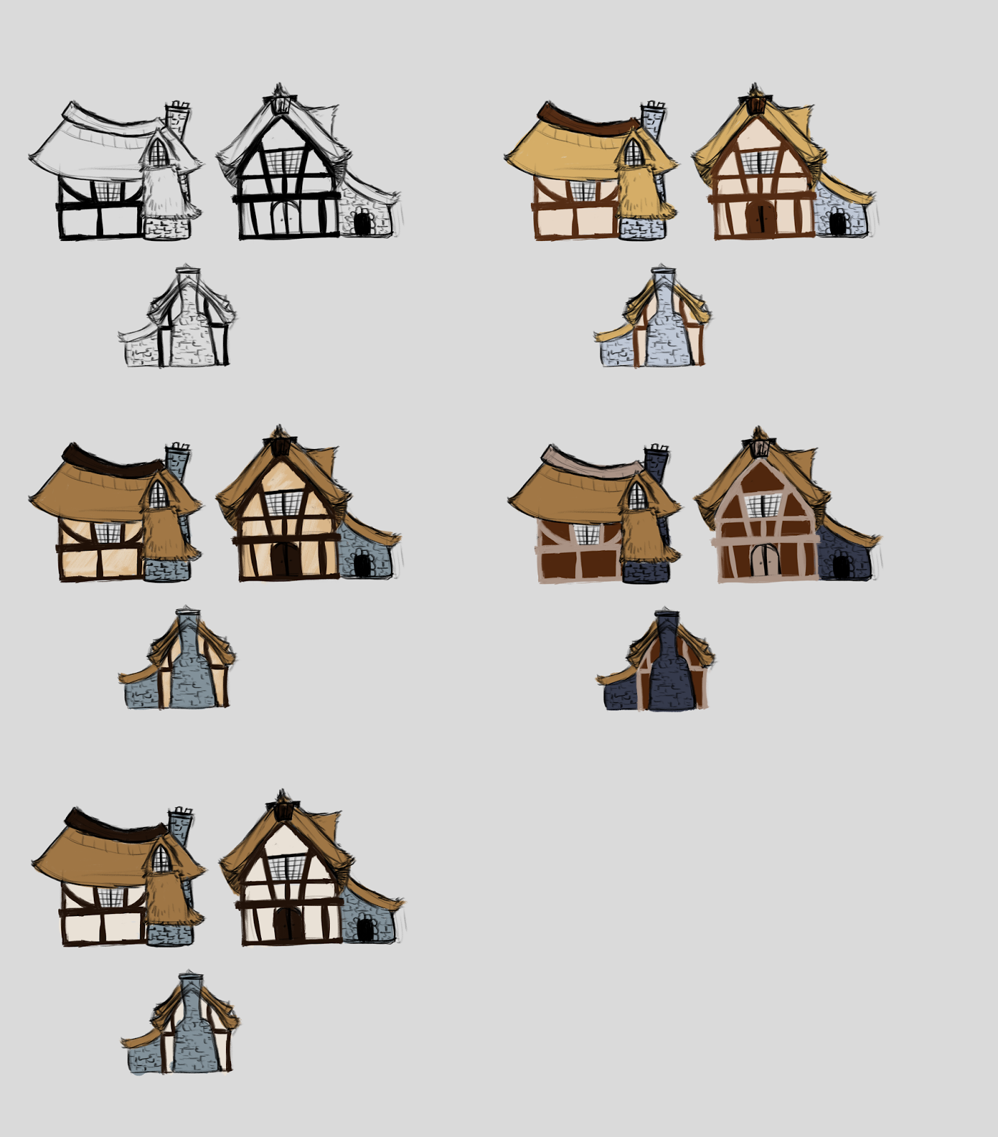
| Colour testing |
When I had got to this point I decided to start modelling while I was in the labs and carrying on with things like this while I was at home as the colours only effect the texturing and I needed to make valuable use of my time while I had the opportunity to use 3DS max in the labs since as I have a mac I'm unable to use it at home.


No comments:
Post a Comment